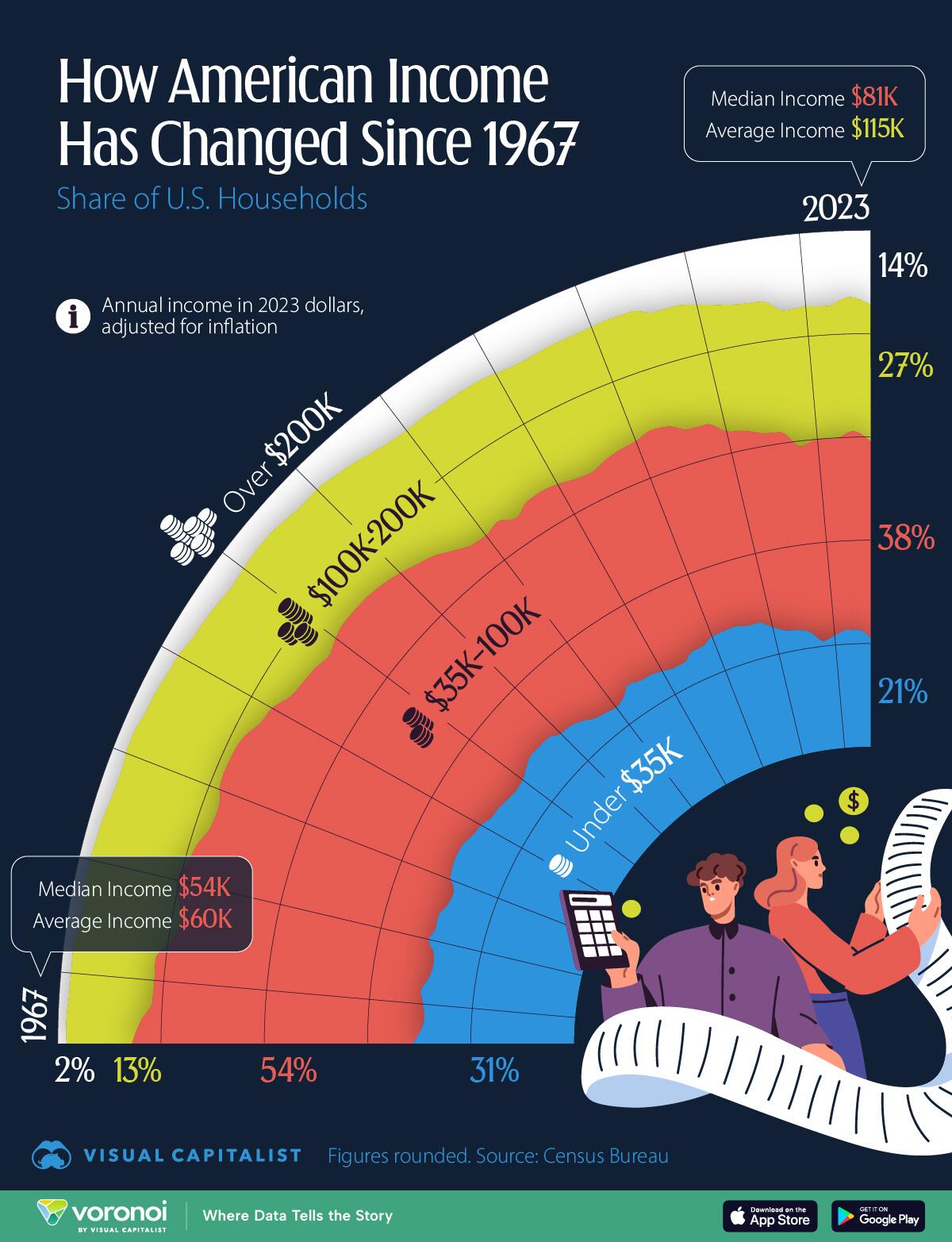
Visualizing How US Household Incomes Have Changed Over The Past 50 Years
This chart, via Visual Capitalist’s Pallavi Rao, tracks the share of U.S. households by annual income bracket from 1967 to 2023.
All annual income is in 2023 dollars, adjusted for inflation, but not for cost of living differences.
Data is sourced from the Census Bureau, published 2024.
Americans Are Making More Money Than Ever Before
Incomes for American households have grown quite a bit in the last six decades.
In 1967, nearly one-third of households made less than $35,000 a year (adjusted to 2023 dollars), and in 2023, that’s fallen to one-fifth.
Here’s the share of households per income bracket for every year since 1967. Categories have been combined from the original source and all figures are rounded. As a result percentages may not sum exactly to 100.
Year
Under $35K
$35K–100K
$100K-200K
Over $200K
1967
31.3
54.4
12.7
1.7
1968
29.7
54.4
14.3
1.6
1969
29.1
52.8
16.2
1.9
1970
29.6
52.3
16.2
2
1971
30.2
51.8
16.1
1.9
1972
29.1
50.4
18.0
2.5
1973
28.6
49.4
19.3
2.7
1974
28.9
50.4
18.3
2.4
1975
30.4
50.1
17.2
2.2
1976
29.7
49.7
18.3
2.4
1977
29.8
48.7
18.9
2.6
1978
28.8
48.3
20.0
3.0
1978
28.8
48.3
20.0
3.0
1979
28.4
48.4
20.1
3.1
1980
29.8
48.0
19.4
2.7
1980
29.8
48.0
19.4
2.7
1980
29.8
48.0
19.4
2.6
1981
30.4
47.9
19.1
2.6
1982
30.6
47.6
18.7
3.1
1983
30.4
47.3
19.2
3.2
1984
29.5
46.6
20.4
3.6
1985
29.0
46.4
20.8
3.8
1985
29.0
46.4
20.8
3.8
1986
28.0
45.5
22.0
4.5
1987
27.8
45.1
22.5
4.7
1988
27.2
45.2
22.6
5.0
1989
26.9
44.7
23.1
5.4
1989
26.9
44.7
23.1
5.4
1990
27.1
45.5
22.4
5.1
1991
28.0
45.1
22.0
4.9
1992
28.8
44.2
22.1
4.9
1993
28.7
44.1
21.8
5.4
1994
28.6
43.7
22.0
5.8
1995
27.4
44.0
22.8
5.8
1996
27.2
43.2
23.4
6.3
1997
26.3
43
23.8
6.9
1998
25.1
42.6
24.7
7.7
1999
24.6
41.6
25.5
8.3
2000
24.2
41.8
25.5
8.6
2001
24.9
41.9
24.9
8.4
2002
25.2
37.1
25.1
8.1
2003
25.7
41.0
24.8
8.4
2004
25.6
41.4
24.6
8.4
2005
25.2
41.5
24.6
8.8
2006
24.6
41.3
24.9
9.2
2007
24.6
40.9
25.3
9.1
2008
25.9
40.7
24.6
8.8
2009
26.1
41.4
24.0
8.8
2010
27.1
40.6
23.7
8.6
2011
27.3
41.4
23.0
8.4
2012
27.4
40.8
23.4
8.4
2013
26.8
39.6
23.6
9.8
2014
26.8
39.8
23.7
9.8
2015
25.3
39.0
25.2
10.5
2016
24.2
39.5
24.9
11.5
2017
23.8
38.7
25.4
12.1
2018
23.0
39.2
25.6
12.3
2019
21.0
38.0
26.5
14.6
2020
21.8
38.1
25.8
14.2
2021
22.7
37.1
25.7
14.4
2022
22.7
38.5
26.0
12.9
2023
21.0
38.1
26.5
14.4
Meanwhile, the other end of the spectrum is seeing growth in the bracket size. In 1967, fewer than 2% of American households made more than $200,000 per year. In 2023, that number had risen to 15%.
Of course, there’s an increase in labor to also be accounted for. Six decades ago, only one-third of all U.S. households had all parents working. By 2009, the situation had reversed.
What This Chart Doesn’t Tell Us
Lastly, looking at incomes is only one half of the story. It doesn’t account for how prices of goods and services have changed relative to growing incomes.
Houses for example cost about 3x the median income in 1967, and in 2022 cost nearly 6x the median income.
However, the vast majority of consumer goods are much cheaper now, relative to incomes, due to how manufacturing has moved out to other parts of the world.
Food is also much cheaper, dropping from 15% of household income in 1967, to around 7% in 2022 – the year when record food inflation had pushed prices up.
Naturally, incomes vary quite a lot across the country. Check out Mapped: Median Income by State in 2024 to see by how much.
Tyler Durden
Thu, 12/26/2024 – 23:00